Client: Earth’s Own*
Agency: Davis
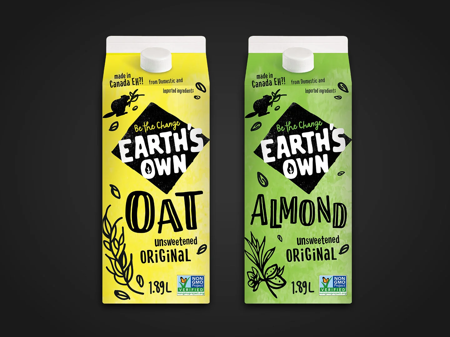
Challenge: Completely rebrand Earth’s own and develop a package to be rolled out to several plant milk varieties. The design should look very organic, carrying connotations that the product is both natural and sustainable, i.e. Oatly’s hand-done design.
Role: Rollout from “Oat” (typography, illustration, colour development)
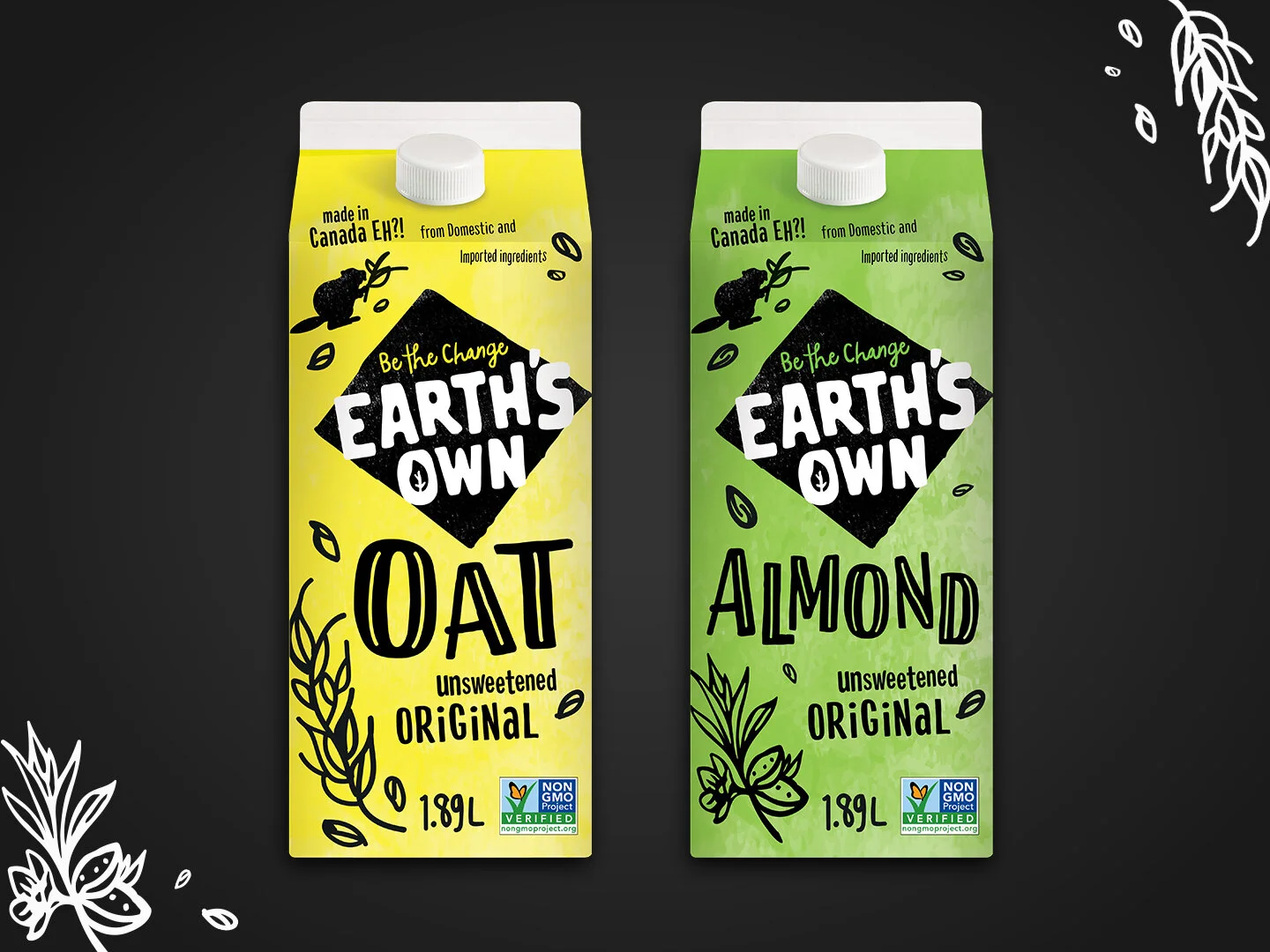
Result: A system for variety rollout rooted in bold, eye-catching colours (based on current Earth’s Own products) and sprinkled with illustrative components as subtle differentiators.
*Concept only.


